Media Queries
The Purpose
Today, there are many different sizes of screens that a website can be viewed on. Designing for only one size in no longer an option. This makes it necessary to sometimes change the CSS based on the size of the screen. For instance a mobile device often uses a mobile menu, but when viewed on a desktop the menu is expanded. To change from a mobile menu to a desktop menu a media query is used. Media queries apply different CSS based on the size of the screen.
How to write a media query
A media query is made up of two main parts, the media type and media features. The main value for the media type is screen, but you can also use print if working on styling how a page will print. The media features can take an array of values, but the main ones are min-width and max-width. Min-width tells the browser to only apply the specified CSS if the browser is at least the prescribed size. Max-width tells the browser to only apply the specified CSS if the browser is no larger than the prescribed size. Here is an example of media query that would work with content that was at least 800px wide.
Adding the CSS
CSS usually doesn't have nested content like HTML. This is not the case when working with media queries. Any CSS that you want applied at a certain screen size actually gets put between the curly brackets of the media query. Indenting these nested rules is good practice to show that they are inside the media query. Here is an example of CSS that is only applied when the browser window is at least 800px wide.
@media screen and (min-width: 800px){
     p{
          color: blue;
     }
     div{
          background: yellow;
     }
}
Activity
Here you can test out what you read, and achieve badges.
Activity Instructions
Do the following:
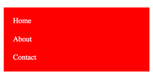
- By default make the background of the <ul> red and the text white.
- Create a media query that adds CSS when the browser window is no smaller than 400px wide.
- In the media query make the <ul> background blue, the text yellow and the menu horizontal.


